https://www.youtube.com/watch?v=yR12qHxStB0
A homepage serves as the digital front door to the website. It’s a crucial element in attracting, engaging, and converting visitors into customers. Designing a good homepage layout requires a blend of aesthetics and usability. An imbalance in one direction or another can affect conversion.
I researched hundreds of websites. I designed and tested many of them myself. I think I found a formula for the best homepage layout that converts visitors to clients. If you’re a seasoned designer, you might know it already. If not, then from now on you will start noticing these patterns everywhere.
All websites with good UX and a high conversion rate follow some basic layout principles. If you ignore these principles you’ll more likely end up creating a good-looking piece of art rather than a good website.
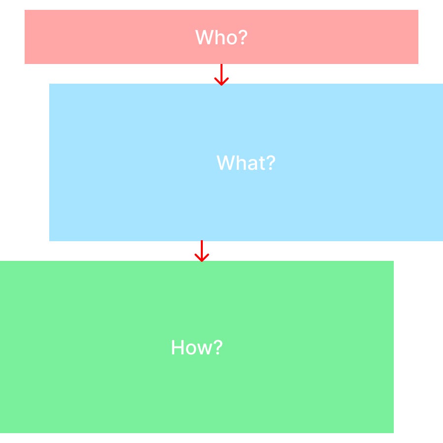
A good homepage or landing page answers 3 questions:
Who are you? What are you doing? How are you going to help me? It’s better to answer all of them above the fold, on the first screen without a need to scroll. When the visitor gets answers to these questions, they will decide if they are interested in learning more and scroll down or visit other pages.

Website structure
So if we break a decent website structure, at the very top, we can see the navigation bar with a logo that answers the Who question — which company or individual this website belongs to.
The big section underneath is called the hero section. Usually, it briefly answers all 3 main questions. There’s a big headline followed by a sentence or paragraph of smaller text below explaining what this company/person is doing and how they can help me with my problem (if I have any). The good habit is to have a call-to-action (CTA) after that — a button that a visitor can click to perform a necessary action.

Hero section structure